Need feedback on photography?

I'm relatively new to the 'photography scene', i.e. Half a year or so. I know I'd never bother to lug around a heavy DSLR so I picked a mirrorless camera (Nikon V1) as my choice. I've kinda picked out some of the better photos I've on flickr, representative of several genres and my optimal (I guess) level of photography?
Are they alright? If not, feel free to explain what changes I could make either during or post-photography? Thanks for your time.


Added (1). -Edwin
1) Hmm yeah I can see how that's possibly distracting.
2) Haha yea I always seem to forget I've hands.
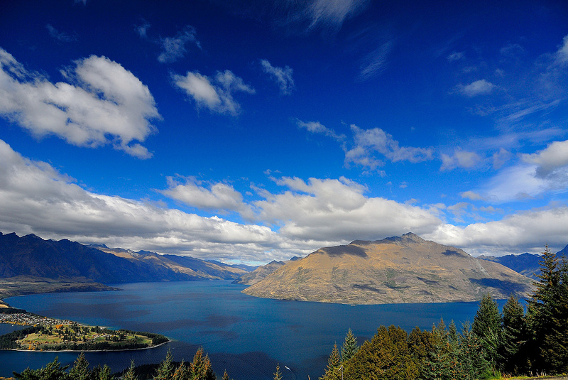
3) Yeah I precisely chose the composition because I felt the sky lent as much weight to the scene as the autumn scenery.
4) Ooh okay.
5) Yeah I think I undersharpened (by default I leave sharpening to zero for raw files).
6)Haha no I was just testing out lowlight capabilities of the V1 in a public aquarium setting.
Thanks for being so detailed, it really helps to have outsider opinion (don't think judging my own photos would be reliable).
-Jorge
Hmm okay.
Added (2). -Jorge
The thing is, with the fountain tilt that both of you have mentioned, the base of it along the 'treeline' is actually straight. If I tilt to make the fountain straight, that would be slanted instead. Yeah I should prob have cropped the scene, just thought it'd lend more colour to the owl. As for the fish haha it was actually intended! I named the photo 'Outcast' on flickr!
I would have tried several different compositions to try and eliminate the (to me) distracting buildings in the background. Also, if you consider the rim of the fountain as a horizon line it looks a little tilted.
 I find the out of focus greenery in the foreground distracting. Again, a different composition could have eliminated this distraction. If all else failed I'd have held the offending leaves down out of the way to get a better picture. Its called "creative license" and used more often than you know.
No doubt someone is going to tell you this "violates" the 'Sacred Rule of Thirds'. Ignore them. It works as-is for me because both halves are of equal importance.
Does nothing for me. More or less snapshot quality. Once again, a different composition could have eliminated the distracting blown-out sky in the upper right.
The owl just doesn't look really sharp to me. Could be my monitor. I would definitely crop out the distracting junk on the left.
A snapshot of a fish. Nice to have if that's your favorite fish and you want to remember it years from now.
 Very nice.
The more you learn to pay as close attention to everything else in the frame as you do to your subject the better your pictures. Once you begin doing that you'll know to use your composition to eliminate possible distractions. Or use your hand to temporarily remove distractions.
Landscapes are best
Extending my answer,
Landscapes are ok, specially the last one; wide angle is good for them and you made good use of it; the fountain is not properly framed, just a couple of degrees will turn it right
Nature views are lack of interest, the bird with closed eyes doesn't need all left overexposed side, the ficus plant or however is called just irrelevant other than also overexposed and the fish is nice colored but lost in its own lonelyness
The point about fountain is that's making a visual point that breaks the photograph; another thing about it, nearly hidden by trees, is the wide angle lines buildings distortion; don't point up when shooting with that lens
