Feedback on my first attempt at portraits? - 1

Would love feed back on these senior photos I took. These were both my first attempt at outdoor portraits. I have a Nikon D3000 and getting into photography. Any suggestions on how to become better would be appreciated.
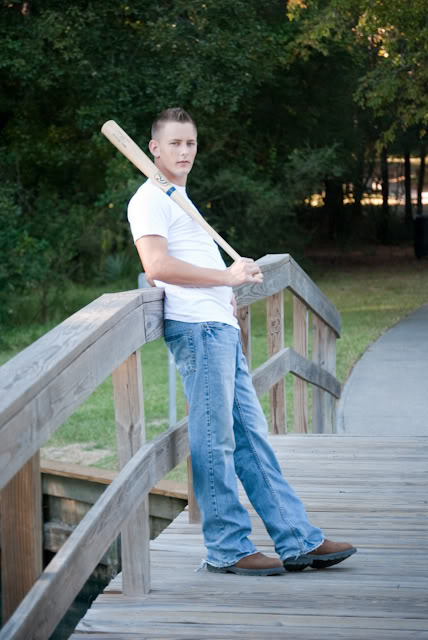
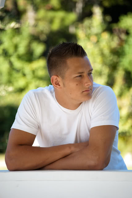
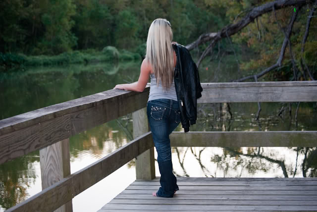
I think they're really nice.
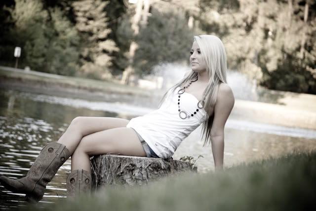
The first one, I like the idea behind it, the angle is nice, but the ground in the photo is distracting.
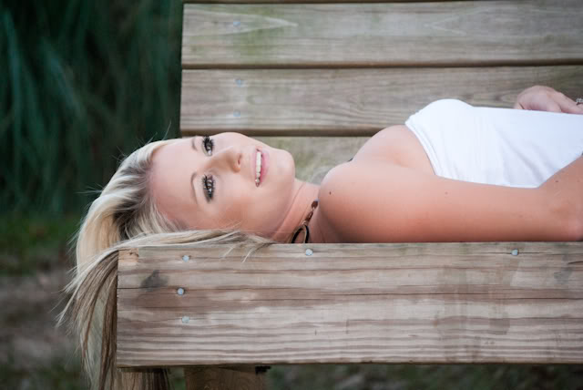
2nd one: Really nice. When you frame a picture, pay attention to things like her hand being cut off, otherwise, good picture!
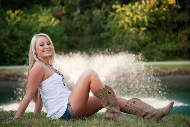
3rd one: Another good picture! You don't have to center your subject, in fact its better not too, but in this case, it would be better if she was centered (less space on the top of the picture)
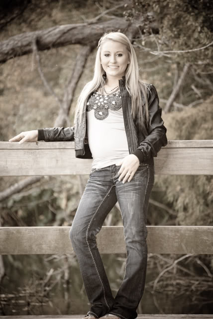
4th: Honestly, not my favorite, the feet are cut off & the subject standing this way is overdone. The black & white or sepia affect is done nicely, though the highlights could be brought out a bit more.
5th: Good, the subject, the guy with the bat blends a little too much with the background. Try to make him pop a little from the rest of the photo. It could be seen as just a snapshot.
6th: My favorite of your pictures! This is done really well! I would say darken the background just a touch & make him pop out even more. But the pose & frame are done really really well!
7th: My second favorite, this is a great picture!
Its a great start, don't give up, look at photography mag's for articles & tips, portraits are done so much, but you've got a good eye & a lot of potential!
