Which photo is better?
Trying to narrow down my photos for a portfolio for college. Since these are all from the same shoot I'm not sure whether I want include just one of them or include two and present them as a set/series.
If you feel there's something that needs to be fixed about any of them feel free to tell me.
(they were taken all with a Nikon D60 and 60mm macro lens)
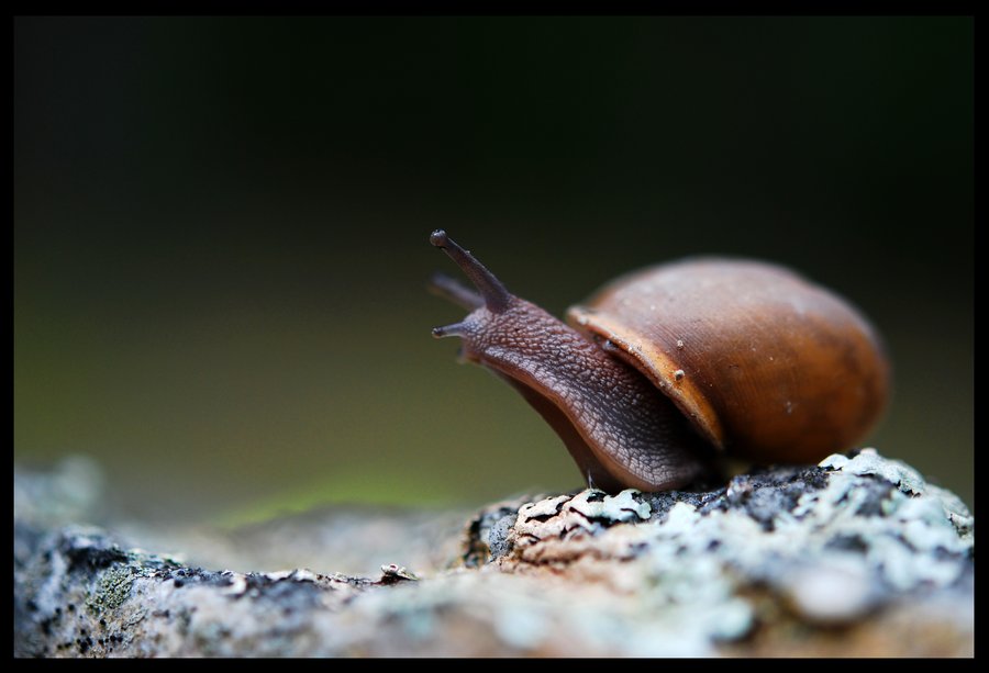
2nd one
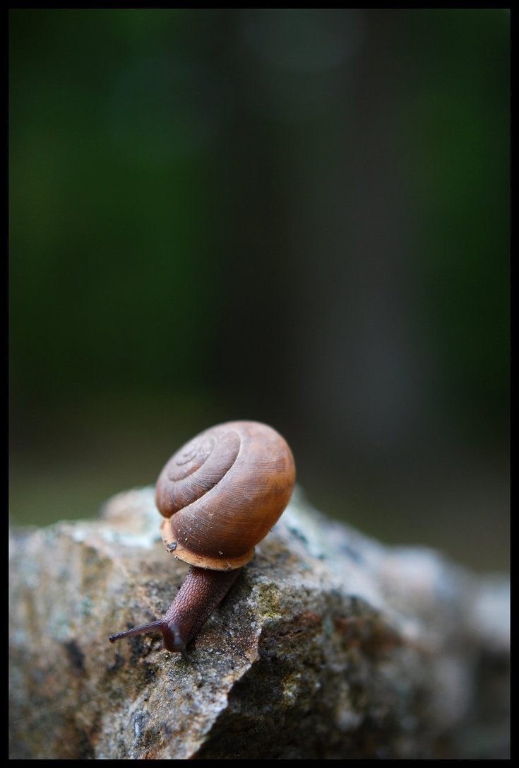
Not a fan of dpq (1) as the subject is moving out of the frame. Leads to a cramped composition.
If you area looking to use an image for stock, i.e. Adding copy or instetting another image, then txf (2) is a good choice. The subject is looking into the negative space. Also this composition is a good use of the rule of thirds.
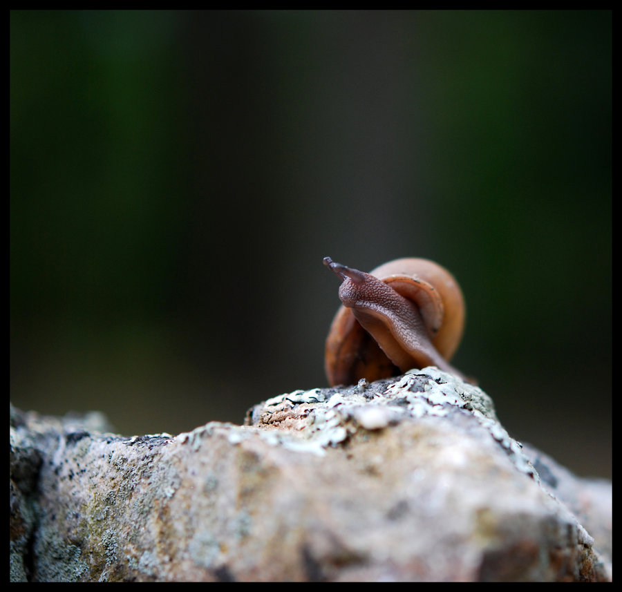
Your third option: at6 has a whimsical feel to it. The square cropping is a nice touch and puts the subject in a near rule of thirds composition. I like that it's different. It's not as trite and expected as the second image.
I'd say the second one. They're all a bit dark however.