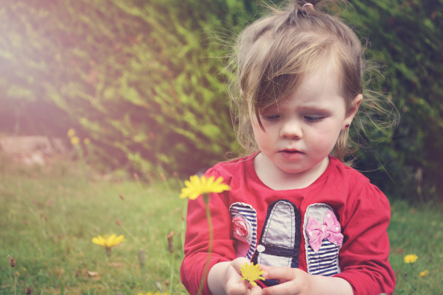
Constructive criticism on my photo?

I'm new to photography and very new to photo editing.
I took this photo with my Nikon D3100 and kit lens.
I had it set to macro and was taking some photos of the dandelions when she came over and picked one, I didn't change the settings just zoomed out and shot her.
It was evening time so in PS I messed around and added a hazy sun flare.
Constructive criticism welcome, what would you have done differently?
PS editing criticism welcome also.
Thank you. 

I don't like the added lens flare.
I'd rather see the image as it was taken. I also agree, you did cut off the hands.
Apart from that and the editing, it's quite nice.
Tbh I would've not bothered with the sun flare. Areas of white in an image draw the eye towards them, so the eye gets drawn to the top left of the frame rather than to the subject.
I appreciate it was a 'grab' shot but it would be nice to have seen more of her hands.
Nicely positioned on a thirds line. Lighting is soft & even & suits the subject.
You are making the number one mistake that practically any person new to photography makes today, … And that is the "editing". So many people have this misguided notion that every photo in existence just HAS to have some kind of "effect" or "edit" applied to it. NO, it does not, and in most cases, such stuff just makes the photo worse and looks amateurish. Don't fall into the trap of thinking you HAVE to "edit" every photo that comes out of your camera. Post processing a RAW file is a different matter, as that involves tweaking the base file information to tweak the photo to be at it's best. That is not the same as putting some kind of "effect" on a Jpeg. So, learn the difference.
It is actually not a bad shot, especially for a quick capture. The skin tone looks a little to the blue side, which is normal for the light conditions. That can be corrected by choosing the Shade / Cloudy setting in the White Balance settings on your camera, or if shooting in RAW, the white balance can be corrected in the software conversion program.
A fourth vote for ditching the fake added "flare."
It doesn't make the image better.
Affective use of the ROT.
The subject is a vertical shape and therefore the framing should have been vertical as well. This would allowed the hands to be in the frame. As is, I don't see a purpose for all of the negative space on the left side of the frame. The NS is occupying about 1/2 the picture! That's a lot of real estate that could have been given to the subject.
Agree with others: hands cut off, lens flare, etc…
I agre about the unsuitable flare.
Also a shame about the missing hands.
Lastly, although the child is perfectly set at a third of the frame. The left side looks bare and bleak.
Pity.otherwise a nice shot.
