Will you critique my portraits I did recently?

All taken with Nikon D3000, 50mm 1.8 manual focus lens. I'm trying to get use to the manual focus (not auto focus on the D3000), and would like any feedback. TIA. This is just a hobby, and do portraits for friends and family. Would love to later down the road, do more than just a hobby!
I had posted these previously a couple days ago, and everyone freaked out b/c it said it was taken with my Iphone. Of course that was NOT the case. Just had some off time and uploaded from my iphone to my flicker App.
Heres the photos:
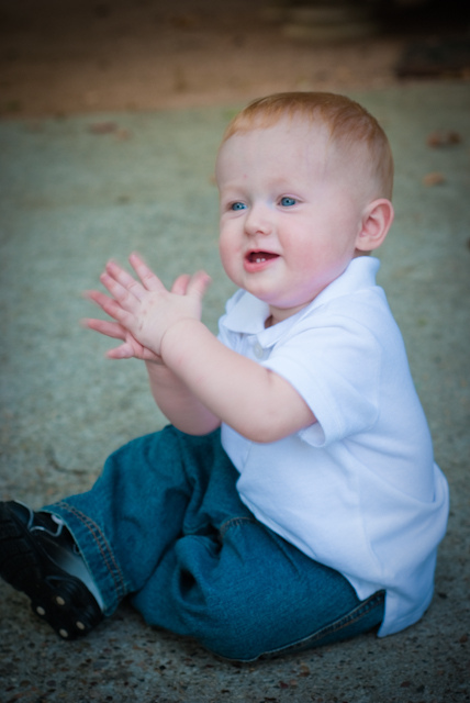
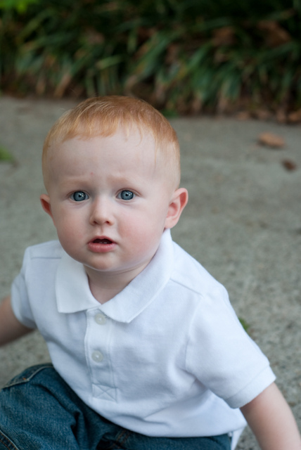

Added (1). Hondo like I ALREADY said, ppl freaked out about the Iphone thing.
These are competent images BUT your photography of people - including children - would be best done with Autofocus to ensure that any movement is captured rather than generate any blurring. The problem with manual focus is that you have to do the work; WHY when the camera has the tools which will let you concentrate on the composition.
I already gave you meaningful critiques of most of these the last time you asked this question. I'm not going to retype my critique from last time.
"Hondo like I ALREADY said, ppl freaked out about the Iphone thing."
What does that have to do with anything? I gave you well though out critiques on each one of your photos from the last time.
I think you just didn't like the honest critique I gave you and have posted this "question" again hoping for a bunch of unfounded compliments.
Here are some critiques of the three new ones you did not ask about yesterday:
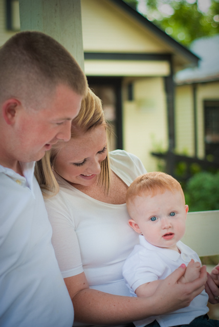
First link listed above: You cut off the hands on the right side of the frame… What is it with you an cutting off body parts?
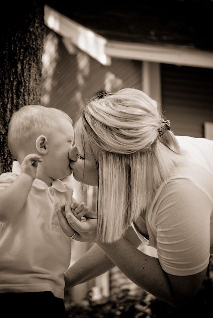
Second link above: Motion blur of the child's hand and strong diagonal roof-line in the background are distracting.
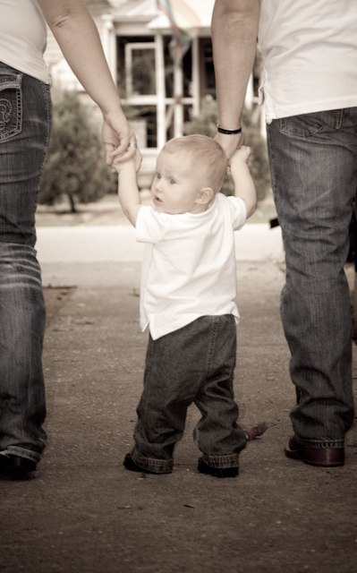
Last link above: Tilt adds nothing, and in this case makes it look like you were falling over while taking the photo. You have also once again cut off part of the person on the left side of the frame, while leaving plenty of room on the right side of the frame that serves no purpose whatsoever. The bushes in the foreground serve no purpose and are a distraction.
There you go, nothing about an iphone, same problems as with your other photos.

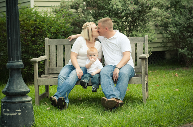
The child and mother are in focus but the father (I assume) is not. Also, the child (which I believe was meant to be the main focus point of the picturefeel a bit awkward in the corner there… It doesn;t feel natural to drag your eye in that direction… At least to me.

Meh… There's some type of blur on the childs hand, the composition isn;t very inspiring.

While the concept is cute, the execution is off.
The child's expression isn't very flattering nor is the pose.

the post is distracting, the composition is a little of center but not "rule of thirds"… The child has his hand in front of his face and doesn't appear involved in the shot at all.

The image is very soft / out of focus.

No major complaints, nice eyes… Too bad about the facial expression.

Tried to be cute with the angled shot but it doesn't hide the fact that there's no balance in your image… The mother is partially off the scene but is obviously supposed to be in it.
Please don't delete and re post questions… It gets annoying for those of us who take the time to answer.
It would be helpful if uyou left your EXIF info on the file for future critique so we can offer suggestions.
The focus seems a little off in many of the shots, but the composition is pretty good.
- Please critique my doggie portraits?
- Where did you purchase your first DSLR Camera? Does it make a difference where you buy it?
- Can you critique this picture please?
- Will you critique my photos? Would love to start doing this For more than a hobby
- Did you know website to buy camera with cheap price and trustworthy?
